Using Paint Shop Pro 6 To Enhance Artwork
George Cassutto, Instructor
This page has lots of graphics. Please be patient while loading.
|
Table of Contents: |
Paint Shop Pro version 6 is a powerful image editing program that can be used to enhance scanned artwork or edit digital photography. I call Paint Shop Pro (PSP) the "poor person's Adobe Photoshop" because it will do almost anything Adobe Photoshop will do at about 20% of the cost. Let's get down to business, shall we?
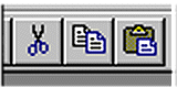
We will start with a piece of scanned artwork. PSP has the ability to work with Twain-compliant scanner software. You would use the file, import, Twain, acquire command, as shown below, to scan an image. Obviously, you'll need to have a working scanner installed.
Figure 1: How to scan an image
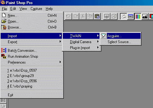
I chose to use some of my six year old daughter's artwork to demonstrate what can be done with it as a starting point. You will undoubtedly have many different ideas, but I'll try to demonstrate them here so you have a guide for developing your own creation.
Here's is what the image looked like after I scanned it. I did not resize it, but you may need to resize or rotate an image right after scanning it so that you have an image that you can work with. If your image is going on the web, try to resize it down to 595 or less pixels wide or else your viewer will have to scroll sideways, unless you don't care about that. You should also think about download time. Large images will take longer to download.
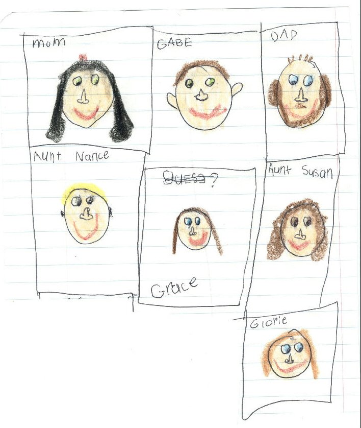
Figure 2: Grace's picture scanned.
If you look at the bottom-right corner any time an image is open in PSP, you'll see the image's dimensions. You can zoom in or out of an image two ways. Click on the magnifying glass (called a zoom tool) at top left. left clicking zooms in closer the the image. This is great when you need to color individual pixels. Right clicking with the zoom tool moves you away from the image. You can always know where you are on the zoom scale by looking at the ratio in the image's file name bar. If the first number is higher (like in 2:1), then you are closer than normal. If you are farther out, the first number will be 1. It's good to zoom out when working with large images and when you need to get the "big picture." Zooming does not change the image's size. It only changes how close or far away you are looking at the image.
Figure 3: Image size is indicated
Figure 3 shows that Grace's picture is 707 pixels wide by 838 high and has 16 million colors. It has so many colors because I save it as a .jpg file. If I wanted to have less colors, I could save it as a .gif file, which has 256. Sometimes you can tell the difference, but if you are working with photography, you should always save the image as a .jpg. If you are creating line art with few colors or gradients, a .gif will do because it will download faster with little loss of quality. By the way, .gifs and .jpgs are the only two image formats that can be read by web browsers. So if you're creating art for the web, it will have to one of those two formats.
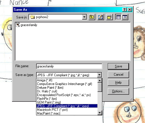
Figure 4: The Save As Dialogue Box
Notice in Figure 4 how many file types PSP handles. If I want to convert any type, say a .jpg, to another type, say a .gif, then I just save it as that type using the "save as type" pull-down menu. Just typing ".gif" after the file name won't do it. I'll end up with a corrupted file that won't open. Be sure to convert files by saving them as another file type.
With 16.7 million colors at your disposal, the color swatch on the right side of your screen will be filled with shades of color. You can just run your mouse over the swatch and the color you click on will become the foreground color. If you use the right-mouse button, then it will become the background color. The small arrow switches the colors back and forth. You can also click on the foreground or background color square to change colors.
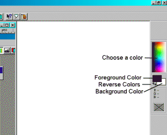
Figure 5: How to choose colors
You can select any color in an image by clicking on the color selection tool (which looks like an eyedropper) and then using that tool to click on any color in an image. In an ID photo once, my bald head caused a large glare spot to appear on the photo. I was going to add more hair to my bald head in the ID photo once by selecting some color from the remaining hair and using the paint brush to add some magical hair. But I thought it would be more honest to select some skin color and cover the glare that way.
These commands are very useful when
manipulating an image. If you select an area of an image, and use the cut
command, the background color will be left in the area you cut. So be sure to
have the correct color in the background color square. here's is your selection
tool:
![]()
Just click on this tool and drag your mouse over the area of the image you want to manipulate. You can then select cut or copy. if you select copy, then PSP will remember what you selected. You then have a number of choices:
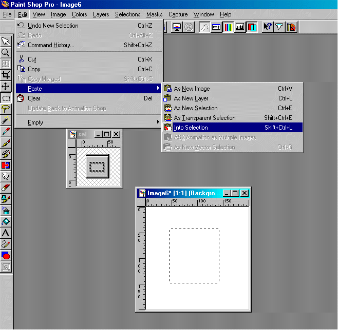
Figure 6: Pasting a Selection
You can paste a selected areas as a new image. That is useful if you have a large image that you want to chop up into smaller parts. I could take Grace's family picture and copy and paste as new image for each family member for each person's web page.
You can paste any selected area into an image as a new layer. This allows you to move or edit the layer even though it's part of a picture. The more layers you create in an image, the more flexibility you have when you want to manipulate the image later. You should promote any selection to a layer whenever you can, especially when adding text to an image. You can see all of your layers by choosing the "show layers" box at the top of the screen. Here's what you see if you choose it while looking at a layered image. Note: only images with 16.7 million colors support layers. If you want to use layers on a .gif file, you'll have into increase it's color depth to 16.7 million colors. If you save a layered file as a .gif, it will merge all your layers, and they will no longer be available to you.
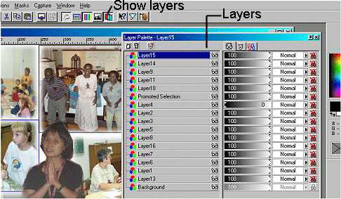
Figure 7: An image with layers
If you don't want what you are pasting to be a new layer, you can paste is as a new selection. You can still move it around or add special effects, while it is selected, but once you deselect (by clicking on any area outside the shimmering selected area, or by going to the selection menu at the top of your screen and clicking on "select none"), then it becomes part of the background or active layer.
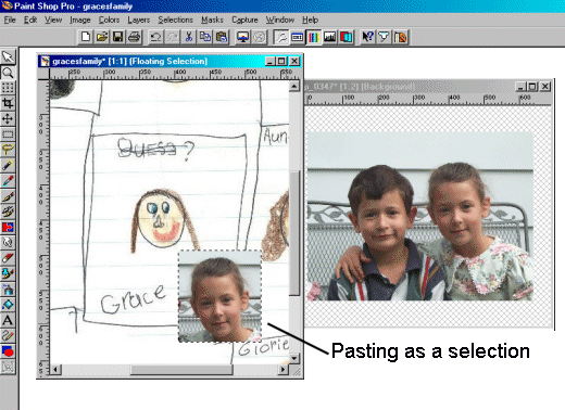
Figure 8: Paste as selection
You can paste a selection with a color you choose to be invisible, or transparent. Just make your background color square match the color you want to be transparent. Then copy the image and paste it somewhere. The background color, which you chose from your image, will be invisible. Very handy when adding elements that overlap. I like to promote the pasted selection into a layer before I deselect. You can promote any selected area to a layer by going to the selections menu at the top of your screen while the area is selected, then choose "promote to layer."
Finally, you can paste a selected area into another selected area. Just be sure the area you are pasting into has the same dimensions as the thing you are pasting.
Feathering is where you create a blurred edge around an image. You can change the way any PSP tool functions by clicking on the Control Panel. It is found at the top of the screen and looks like this.
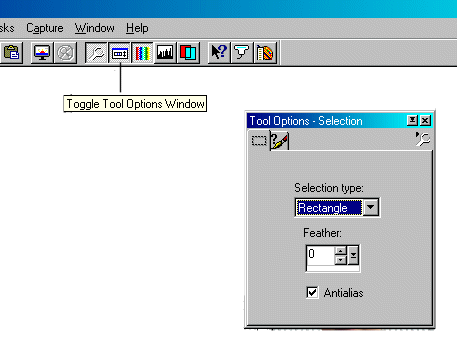
Figure 9: Control Panel Toggle
For each PSP tool, the control panel window will look different. You can change the size of your brush or how dark you want a certain effect to be. You can also feather your selection, which will cause the shimmering line (called the marquee) to bend and become rounded. If you paste into a feathered selection area, you'll get the blurred-edge effect. It looks like this:
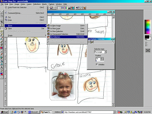
Figure 10: Feathering a selection
Notice that the selection tool has a feather setting of 15 pixels. The marquee around Glorie's photo has a curved edge. the paste command was Paste, into selection. Generally, I create a new layer BEFORE creating the selection area and pasting. This keeps the pasted item off the background and available for manipulation. A new layer is created by going to the layer menu, then "create new raster layer." I use the feather tool when creating a collage of multiple images. If you look at the image in figure 7, you'll see such a collage with multiple feathered images, all of which are pasted into selections and then promoted to layers.
This tool is one of the most used tools in the program. But you need to have a steady hand to use it well. Your control panel allows you to change the size of the brush. You can change its shape as well as its texture by clicking on the little "gears tab" at the top of the control panel window. Here are just a few of the textures available:
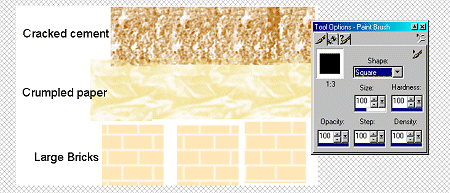
Figure 11: Paintbrush Textures
This tool allows you to paint using the pattern of another part of the image. First, you must select the source of the pattern you want to copy or paint with. By holding the shift key and clicking wherever you want to copy from, you have selected the source. Then move your cursor to another part of the image and press the left side of the mouse. You'll see a cross hair where you shift-clicked, and the pixels from the source will appear where ever you are painting.
Picture tubes are one of the coolest features of PSP. Just select which mini-image you want to pop onto your image. You'll have to toggle your control panel on. Then choose an image.
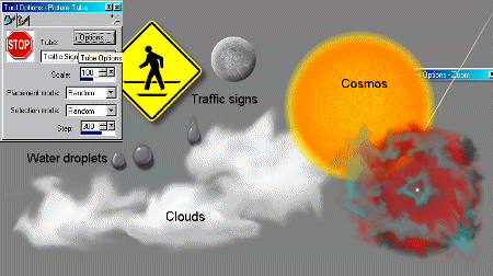
Figure 12: Picture Tubes
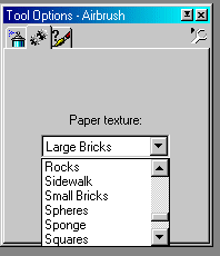
Figure 13: Air Brush Options
The air brush also has numerous options which can give the artist great flexibility. You are limited only by your own creativity. Remember to change your brush size. Here are two examples of how to use the air brush:
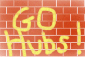
Figure 14: Using the Air Brush
This example used an air brush set at 200 pixels for brush size (the image is 200 pixels high, so filling it with bricks was easy). I set the tool to "large bricks" and the color red to create the wall. Then I went to a brightly contrasting color and tightened the brush size to 30 pixels. Then I wrote the graffiti on the wall. Even though I don't teach there any more, I am still partial to the Hubs of North Hagerstown High.
This tool is great for coloring large areas quickly. But there is a trick to watch out for. On the control panel for flood fill, there is a setting for "tolerance." This tells PSP how aggressive to be when filling an area. The lower the number, the more PSP respects the other colors. the higher the number, the more aggressive the program is. This means that at a lower number, PSP will flood fill only pixels of similar colors to the one you clicked on when flood filling. At higher numbers, you'll see the flood flowing over borders and into holes, so a part of your picture that you did not wanted changed may be flooded. If that happens, lower your tolerance. As you can see in Figure 15 below, I flood filled with white, but my tolerance was set too high. That's why I have no skin color in my face!
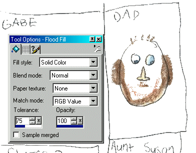
Figure 15: Tolerance settings
Flood fill allows you to flood fill an area with another image. A good example is using the American flag to fill text so that the flag comes through in the words only. First bring up an image you want to use as the source. Choose "pattern" for your fill style. Then click on the middle tab of the control panel window and click on the file name of the image you want to use as your source. In figure 16 below, I am using a flag I copied from Internet Explorer into PSP, so its file name is image33. I then used my text tool (which we'll discuss next) to create a selection area. The last step is to flood fill my letters. because I had white in the letters on a white background, I used the chisel tool in the special effects menu (image, special effects, chisel). By using the transparent setting and the background color (black), I was able to give the letters greater definition after flood filling them with the American flag.
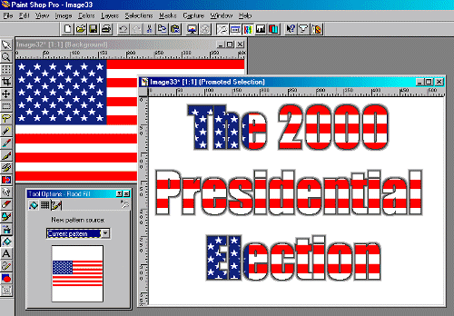
Figure 16: Flood filling with a pattern.
The text tool gives the artist a lot to think about. You can see in the dialogue box below that when you add text you need to think about the color, size, font, position, and style of the text. Then you may want to add effects like chisel and drop shadow to your text. You'll have to experiment with what is available, and you'll have to keep in mind the function of the text in the image or in the web page, as well as your audience. For Grace's artwork, a festive, fun font seemed to work. So I chose Jokerman.
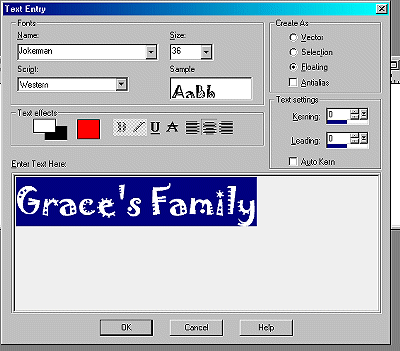
Figure 17: The Text Dialogue box
Make sure your "create as" button is set to "floating." You can set it to "vector" if you want to resize or distort the text once you place it on the image. Also, clicking the anti-alias box reduced the amount of jagged edges that may appear around the edge of the image. It provides a smoothing effect.
The special effects menu allows you to do quite a number of things to your image. The most common include buttonize, chisel, drop shadow, inner and outer bevel, and a number of other effects. The tip to remember is that you always want to keep your images at 16.7 million colors when applying these effects. If they are dimmed or unavailable, it's because you need to be at 16.7 million colors. The way to do that is to click on the color menu at the top of the screen, and select "increase color depth." Once the progress bar is done, you have enough colors to add your special effects. You will almost always have to select an area, whether that be text (apply the effect before deselecting), the entire image, or a section to selected. Also, once you promote a selection to a layer, you can apply a special effect to that layer individually. This can also be troublesome if you have not moved to the layer you want to effect. Just click on the layer button at top, click on the desired layer/item, and then apply the effect you have chosen.
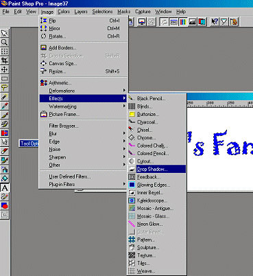
Figure 18: The Special Effects Menu
Here's what a drop shadow looks like. The drop shadow box can seem complex by itself, but you'll figure it out quickly. Just slide the bars to determine your horizontal and vertical shadow and choose your color and blur level. For writing and text, I would keep my horizontal/vertical to about 2 or 3, or else it becomes hard to read.
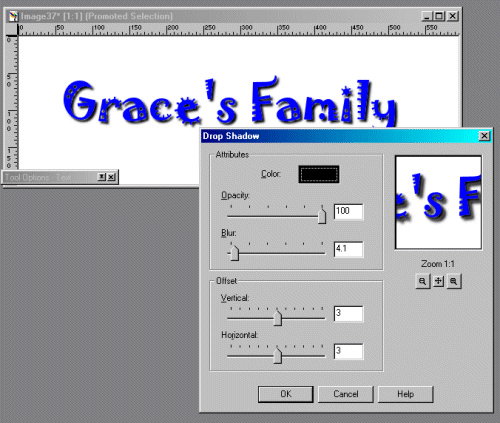
Figure 19: Adding a drop shadow
Well, there's so much more to learn about using PSP, but the best way to do it is by experimenting. And don't give up if you have trouble at first. PSP is a great program, and with your talent, you'll be able to create very cool stuff. I do hope this brief guide was helpful. If you have any questions, just e-mail me, George Cassutto, at georgecassutto@hotmail.com I'll see if I can help. And be sure to visit my website at http://www.cyberlearning-world.com.
Good luck!